


Edit Project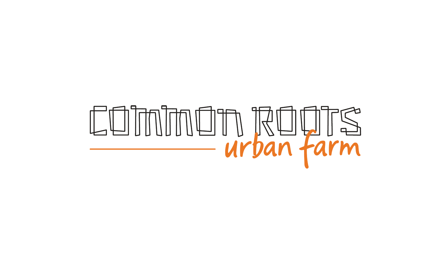
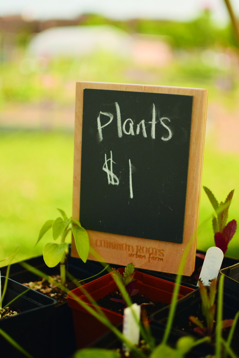
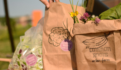
Common Roots Urban Farm
As a multi-faceted community project, our job was to create a brand for Common Roots that espoused their values, connected with their members, but also upped the game so they could reach a sophisticated audience of donors and grown-local buyers. In creating the brief, we realized this brand needed to function well dressed up or dressed down; it needed to belong in the rough and tumble farm environment, on a beautiful bunch of flowers, and at a high end fundraiser.
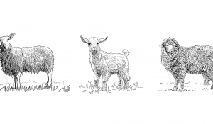
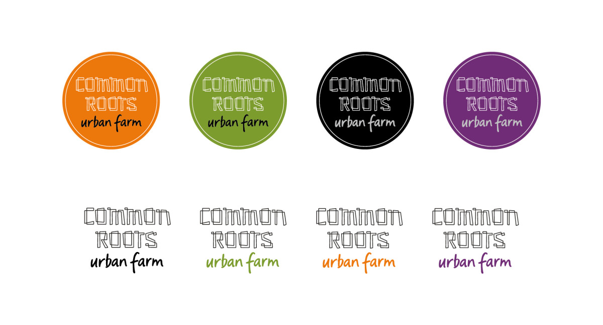
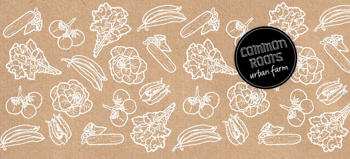
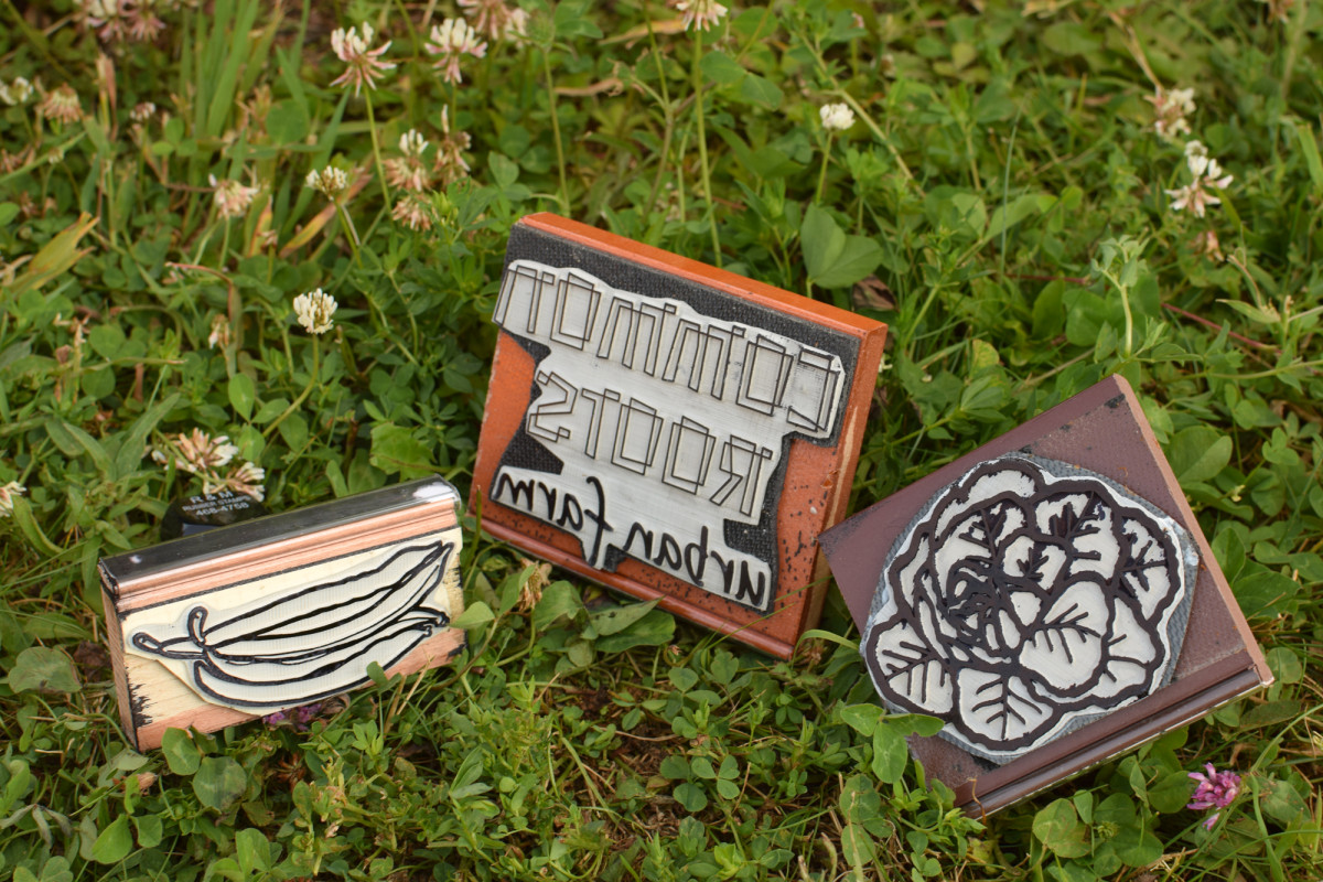
The hand-drawn logotype, that alludes to plot boxes for many, feels simultaneously rough and sophisticated, structured and human. We build a colour palette from existing colours to stand out and work well with different products and production needs. To complement the new logo, we paired with Anna Ramsay for some hand drawn veggie illustrations to bring some fun and context.
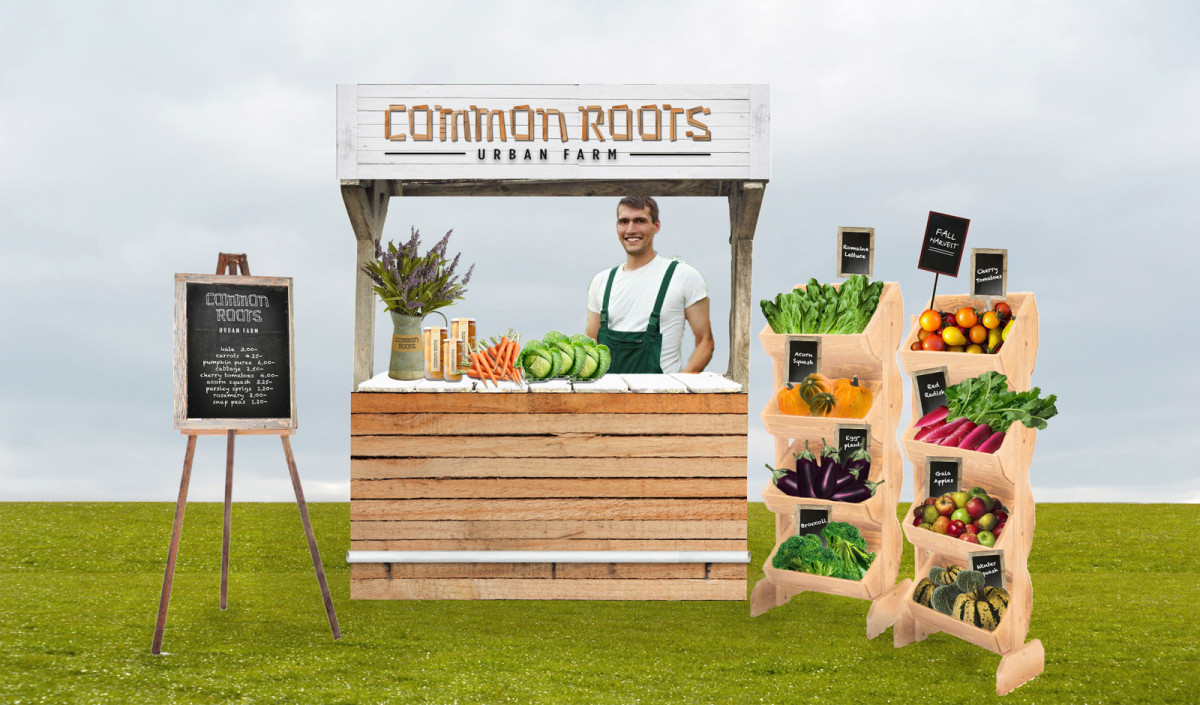
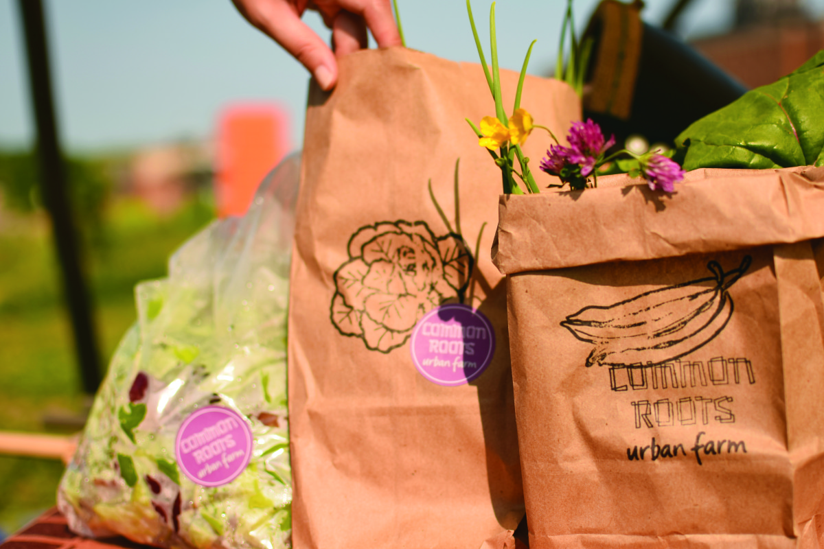
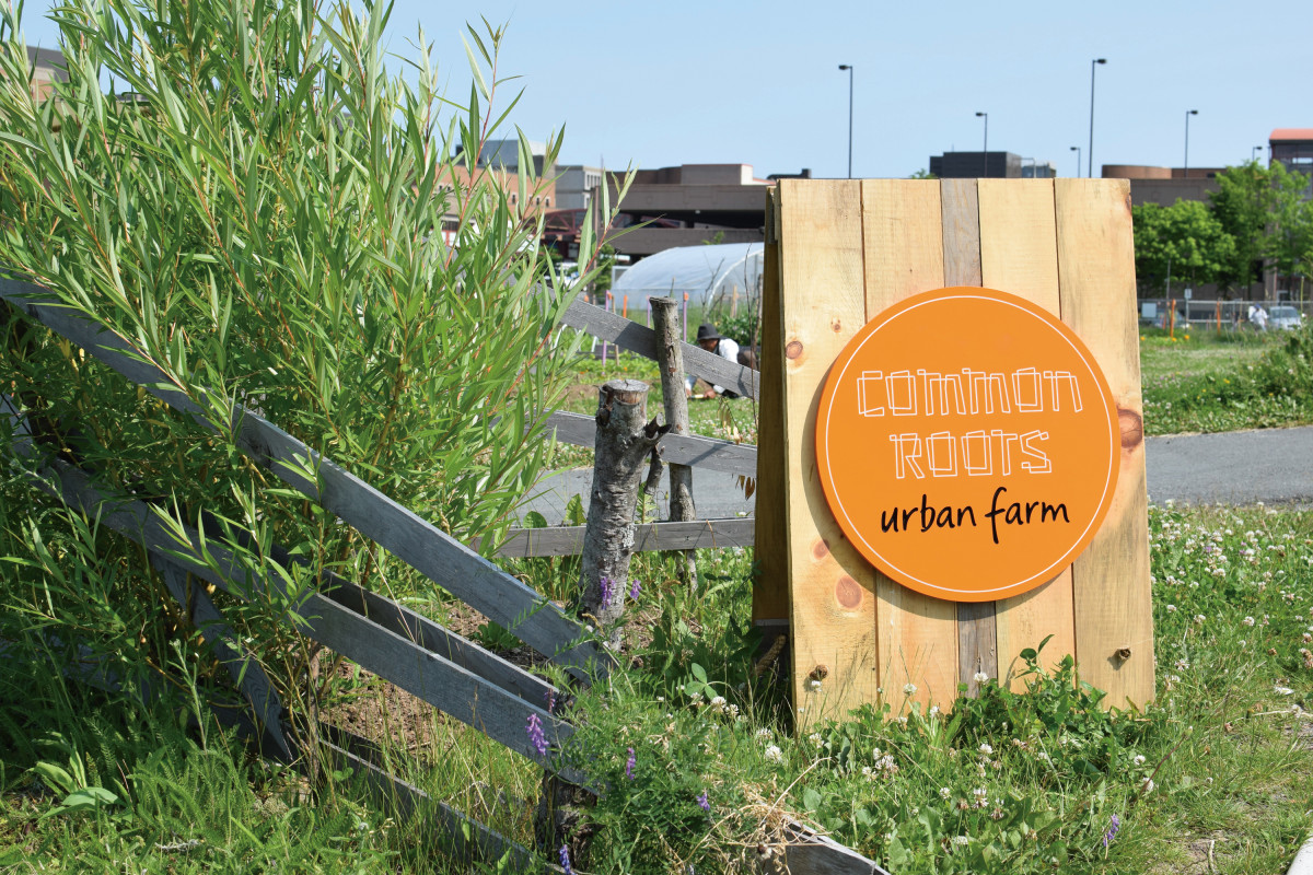
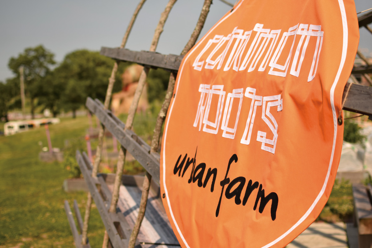
The new branding is carried across various applications, such as stamps for their paper bags and flower bouquet wrappers, stickers and signage. Rarebird's own Lizane Tan created the fabric signs.